Very early on in the design process for Wallachia I decided that I’d be writing the book using a form of Markdown. I wanted to be able to precisely control the formatting for body text, different levels of headers, and so on, and didn’t want to trust myself to not mess this up using a regular word processor. If I type #chapter title it’ll always get formatted the way a chapter’s title should. In the end I wrote a version of Markdown in Swift that replicates most of its regular expressions and returns the result as an attributed string that I can hand over to the system’s text storage and layout manager.
Taking a few cues from Fountain, I worked out what syntax I might need, adding in codes for drop caps at the start of chapters and small cap text where needed. (Though, I’ll point out, Baskerville doesn’t have true small caps that iOS can use as far as I know.)
Something I knew I’d need was a way to define breaks in the text, usually when there’s a scene change. The simplest way to do this is just leave an empty line, but you can run into problems when a section break occurs at the top or bottom of a page, making them harder to pick out. HTML has the horizontal rule, and Markdown has a simple syntax for generating one: a series of hyphens or asterisks.
What, then, to make the section break look like?
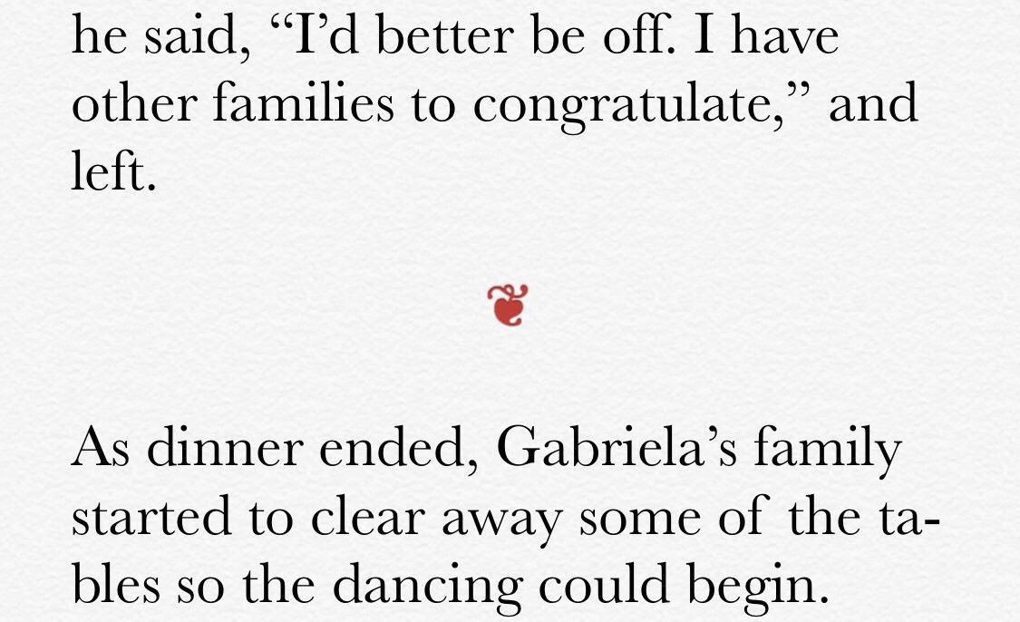
After a bit of research into somewhat archaic typography, I discovered fleurons. These little leaves generally come in three varieties: ❧, ☙, and ❦. Also called a “floral heart,” I thought the symbol had a small touch of vampire-ness to it. Historically, the sideways versions could be used to fill the indentation space in a paragraph, and the upright floral heart was used to fill the space between paragraphs. Perfect!
Here’s what the fleuron (also called an hedera) looks like in the Wallachia app.

Elsewhere I use the sideways versions to decorate the page numbers and as markers for bulleted lists.